Responsive or Adaptive Design? Find out which one is better for you

JetThoughts has launched a new project recently. Whole front-end team was set and started developing the UI part. They designed selected and adapted the suitable libraries, plugins, distributed the tasks — everything as usual. At this stage, a question arises: how the customer sees his future application. Fortunately, we’ve already had several ready design layouts based on which we could estimate the basic layout. Was it responsive in this case…. or adaptive after all?
There are many posts and discussions on a subject in what way a responsive design differs from an adaptive one. Why use one or another, what types of layers the global information resources, social networks (Facebook, Twitter, AIRBNB) use — we are going to consider this issue for our part. First, let’s have a look at peculiarities of these approaches once again.
Responsive Design #
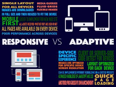
When we talk about the responsive design we mean the layer only. Ethan Marcotte, the author of this concept, at his time (in 2010 , has singled out 3 basic definitions of responsive layout:
media queries,
fluid grids,
flexible images.
You should pay attention to the concept of fluid and flexible. Initially, we prepare our content for a proper display on most devices and screens. This integrated approach, in some sense, proves its worth — we send all the content to the client browser, and the browser handles it with regard to the window size.
We use a single template for all devices; our flexible images are loaded in full size, and then the size is adjusted to fit the block size. All these affect the download speed. And we have to wait longer for loading than if the browser would get the content exclusively for the device and the window size. Here the adaptive design comes forward.
Adaptive design #
“Adaptive” is a broader concept, and, in my opinion, the responsive design is only a part of the adaptive in this instance. It is believed that the difference of the adaptive design consists only of the fixed width of the block on various screens. But it’s not actually true. In this case, the concept of adaptive design and adaptive layout are identified. Apart from the fact that it “adapts” to different sizes of the screen, the content may also use different layouts for different devices of screen size; styles, images, JavaScript, event handlers for a particular device, and screen size will be loaded separately. This optimization can increase the page loading speed more than twice.
Certainly, faster loading with optimized code for a particular device is a good option for a design. However, it requires an excellent knowledge of JavaScript and CSS, more meticulous work to set up the service display and, more time in general. It’s up to you to decide whether it’s worth it. You should also remember that we can identify the device on server-side by transmitting a ready code to the client without additional requests.
The above-mentioned social networks use a hybrid approach in the most cases. Twitter uses an adaptive layout for laptops and a mobile version for tablets and smartphones. Facebook has nearly the same approach. Google, for instance, advocates a responsive design as the king of layouts .
So, whether to use the adaptive design? If you are looking for a comprehensive solution, the adaptive approach is unlikely to be the best choice. In fact, you should take into account the actual needs of the project and its users. The use of adaptive design pays its way if you need to display your application on several specific devices, or you want to implement various experiences of interaction for users on different devices, or if the service speed on mobile devices is critical for you.
Responsive design remains popular, because it is easy to set up a relatively good performance. In fact, the adaptive design might ensure even faster productivity, but a “convenient” solution for working with the adaptive design has not been found yet.
Some links for a deep description of difference between adaptive and responsive: